4 Important CSS Concepts I learnt
As part of Release 1.0 of my URL Generator project, I learnt several important CSS concepts. Here is a summary of four of those concepts.
CSS Box Model
CSS Box Model is the central concept behind CSS. In simplest of terms, CSS Box Model represents the Rectangular Box that wraps every HTML element. By adjusting different Box Model attributes we can create different layouts for web pages as well as position elements for optimum user experience. Here are some great tutorials on CSS Box Model.
- http://www.w3schools.com/css/css_boxmodel.asp
- http://www.cssnewbie.com/understanding-the-css-box-model/
CSS Reset
While CSS Box Model is at the core of CSS, anyone learning and experimenting with CSS will probably encounter CSS Reset in the beginning. Let’s understand CSS reset with a short example.
In the screenshot below, there is a simple web page with a H1 tag whose background color has been set. As you can see the box for the H1 tag is placed at a certain distance away from the edge of the browser viewport. This is because the browser has some pre-defined border and padding values for each element’s box. The gaps are highlighted by the red box.
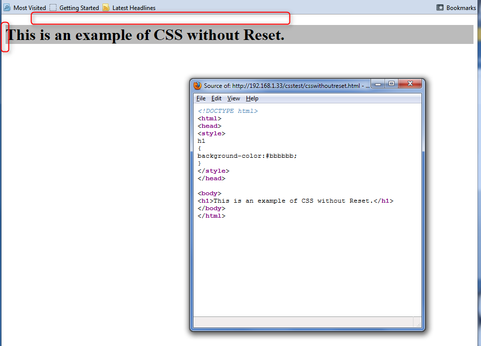
Example of CSS without Reset
Next let us force the the border and padding values for H1 tag to be zero. With that the same HTML content is rendered as below. We have effectively reset the browser default values and as a result the H1 element moves all the way to the edge of the browser viewport.
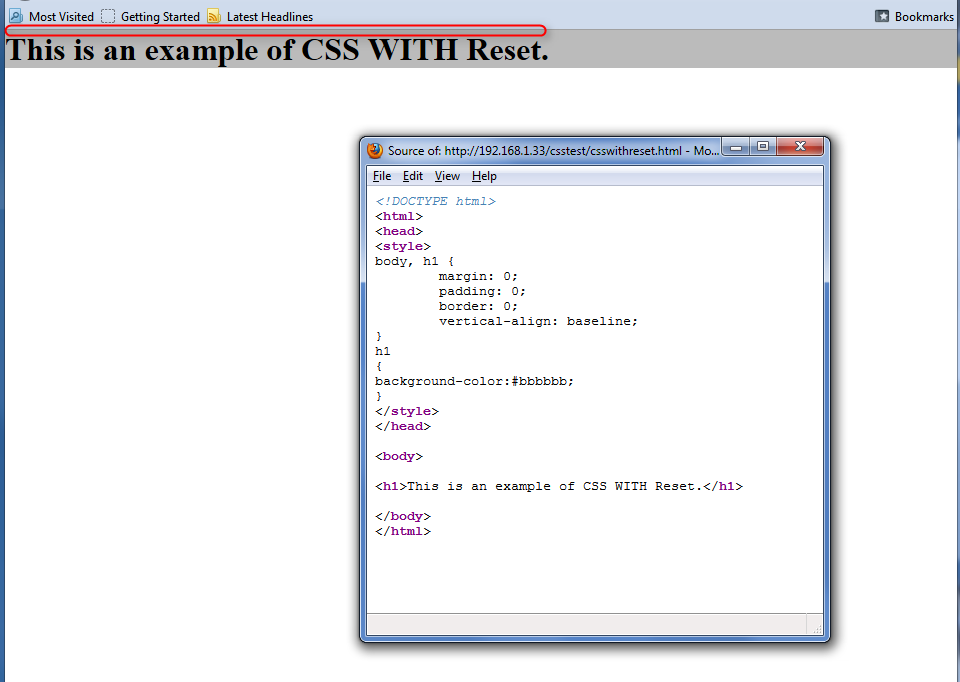
Example of CSS with Reset
CSS Troubleshooting
CSS Box model gives us the capability to place elements anywhere in the browser viewport. But this also means that alignment between various HTML elements has to be spot-on. While browsers such as Firefox and Chrome have advanced developer tools, we can employ a very simple CSS trick to view the alignment and troubleshoot the layout.
Just add the following style at the end of all styles or stylesheets in your HTML file.
Note: you can choose different border style and/or border color. Once this style is added, every element (represented by *) will have dotted red border. This provides a visual cue to view the alignment of all elements. Here is how the URL Generator web page looks like with this style.
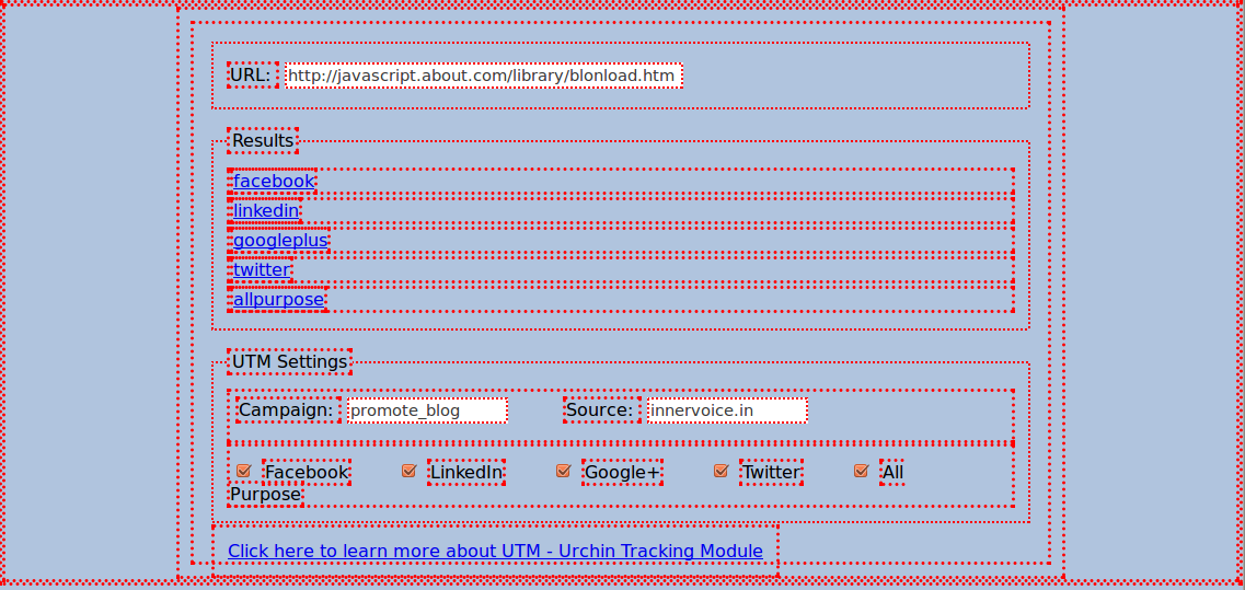
Web page with CSS Border
CSS Media Query
Mobile devices such as tablets and smartphones are increasingly being used to consume content on the Internet. So it is imperative that all websites support flexible layouts to improve the user experience on devices of varying sizes and resolution. Media Query techniques help us implement responsive UI design for different screen sizes and hence address this crucial requirement.
Using media query you can load different CSS files based on device screen sizes. Here is the snippet of my URL Generator HTML file where I have used Media Query:
As you can see for device with screen width more that 960px (I am considering this as Desktop) I am using a different CSS file. This is probably among the simplest usage of Media query.
Here are some great tutorials on Media Query: